Fusedash vs StatPecker
Side-by-side comparison to help you choose the right tool.
Turn raw data into clear dashboards instantly so your team can act on insights fast!.
Last updated: March 4, 2026

StatPecker
StatPecker instantly turns your data into stunning, shareable AI insights and visuals!.
Last updated: March 1, 2026
Visual Comparison
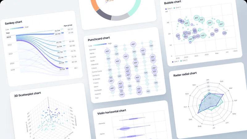
Fusedash
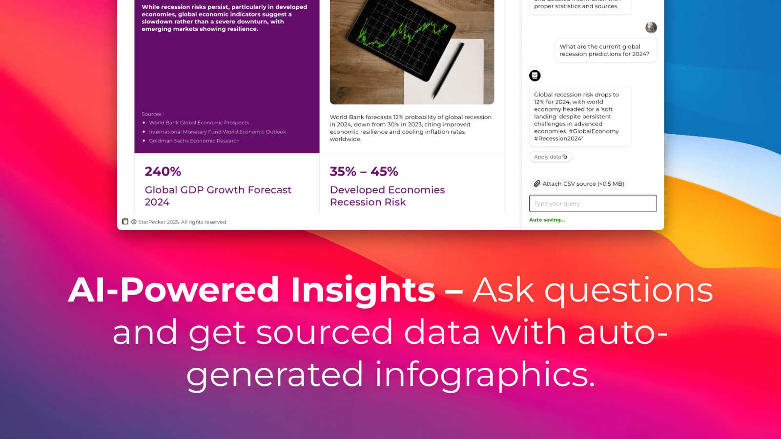
StatPecker
Feature Comparison
Fusedash
Flexible Multi-Format Views
Build the perfect view for every audience without duplicating work! Fusedash lets you transform a single dataset into interactive dashboards, standalone charts, detailed maps, or narrative report-style views. Customize layouts, filters, and time ranges to give each team exactly what they need to see, ensuring stakeholders get clear answers without the endless back-and-forth. It's all about delivering the right insight in the right format!
AI-Powered Chart Generator
Create stunning, insightful charts in minutes, not hours! Simply upload a CSV or connect an API, and let Fusedash's AI suggest the best chart types and visualizations for your data. Effortlessly add comparisons, apply filters, and refine labels to make sure every chart tells a compelling story. Use these visuals as standalone assets or drop them directly into your dashboards for a seamless workflow!
Unified Dashboard & Reporting Workspace
Go beyond static dashboards and combine performance monitoring with rich context! Fusedash provides one cohesive workspace where you can build real-time KPI dashboards and pair them with narrative storytelling sections. This powerful combination makes it crystal clear what changed, why it matters, and what the next steps are, reducing confusion and keeping every team member aligned on the same page!
Smart AI Data Chat
Ask your data questions in plain English and get instant answers! Stuck on where to begin? Use the integrated Smart Chat to explore breakdowns, request specific metrics, and get intelligent suggestions for charts or dashboard views. Then, instantly turn those conversational insights into shareable, interactive views that your whole team can use. It's like having a data analyst right at your fingertips!
StatPecker
Ask Your Query
Get instant insights from validated sources using powerful AI! No complex tools or coding knowledge is required. Just ask a question in plain English, and StatPecker will generate credible answers accompanied by clean, ready-to-share charts and visuals. It's the fastest way to go from curiosity to a publishable graphic!
Upload & Analyze CSVs
Extract key insights from your local data files with absolute privacy! Upload a CSV (up to 50 MB) and explore it with simple questions. Everything runs securely on your device with the Local SQL Agent, keeping your data private by default. Watch as it prepares, analyzes, and visualizes your data into actionable insights without the spreadsheet hassle!
Publish & Embed
Make your data visuals interactive and seamlessly integrate them anywhere! StatPecker lets you embed your stunning infographics directly into blogs, articles, and websites with ease. This feature ensures your audience gets an engaging, dynamic view of the data, boosting comprehension and shareability across all your platforms!
Download & Use Anywhere
Export your creations as high-quality images for maximum flexibility! Download your infographics and use them in reports, presentations, social media, and printed materials. This gives you complete freedom to tell your data story anywhere, ensuring your impactful visuals work across every medium and meeting!
Use Cases
Fusedash
Executive Leadership Reporting
Provide your leadership team with a single, trusted source of truth! Consolidate data from across departments into a unified executive dashboard that highlights key business KPIs. Combine high-level charts with narrative storytelling to give context on performance trends, enabling faster, more informed strategic decisions without sifting through conflicting reports!
Marketing Campaign Performance Monitoring
Track the impact of every campaign in real-time! Connect your marketing platforms (like Google Ads, social media APIs) to Fusedash and build dynamic dashboards that show engagement, conversion rates, and ROI across channels. Use drill-downs to analyze performance by segment or region and quickly generate shareable reports to showcase results to stakeholders!
Operational & Logistics Oversight
Gain a crystal-clear view of your operations! Upload logistics CSVs or connect to supply chain APIs to create detailed maps and dashboards that monitor shipment status, inventory levels, and delivery times. Identify bottlenecks instantly, understand regional performance variations, and create operational reports that keep every team aligned on efficiency goals!
Sales Team Performance & Forecasting
Empower your sales team with actionable insights! Build dashboards that track pipeline health, quota attainment, and regional sales performance in real-time. Use AI Chat to ask questions like "Which product is trending up this quarter?" and instantly generate charts for team meetings. Share consistent performance views to motivate the team and align on targets!
StatPecker
Supercharging Business Reports
Transform dense quarterly sales data into compelling visual narratives in seconds! Analysts and managers can upload their CSV files, ask "Which regions drove the most revenue?" and instantly get a beautiful chart. This turns lengthy, tedious reports into engaging presentations that stakeholders love and understand immediately!
Enriching Blog Posts & Articles
Captivate your readers with interactive, data-driven visuals embedded directly in your content! Bloggers and content creators can use StatPecker to quickly find supporting statistics and turn them into stunning infographics. This boosts credibility, increases time-on-page, and makes complex topics easily digestible for your audience!
Simplifying Educational Material
Make learning engaging by turning abstract numbers into clear, visual stories! Educators and trainers can simplify complex datasets for students. By visualizing trends and comparisons, StatPecker helps explain difficult concepts quickly, making lessons more interactive and memorable for everyone in the classroom!
Empowering Marketing Analytics
Visualize campaign performance and customer insights with stunning clarity! Marketing teams can analyze CSV exports from their tools to identify top-performing channels or demographic trends. Creating shareable infographics from this data helps align teams and create persuasive content for case studies and social proof!
Overview
About Fusedash
Tired of data chaos and conflicting reports? Meet Fusedash, the AI-powered data visualization platform that transforms your raw data into a unified source of truth! It's the all-in-one workspace where teams can finally break free from manual reporting cycles and disconnected tools. With Fusedash, you connect your data once—from CSVs, APIs, or databases—and then build everything you need: decision-ready dashboards, interactive charts, detailed maps, and narrative reports, all from that single, consistent dataset. The magic is in the consistency! You define your key metrics and KPIs one time, and then reuse those trusted definitions across every view and report. This ensures everyone in the organization, from leadership to marketing to operations, is aligned and acting on the same accurate numbers. Built for teams that demand both speed and depth, Fusedash not only lets you monitor what's happening in real-time but also understand why with powerful drill-downs. Plus, with integrated AI features like natural language data chat and smart visualization assistance, exploring data and building reports becomes faster and more accessible than ever. Stop rebuilding and start revealing insights that drive real action!
About StatPecker
Tired of staring at endless spreadsheets and struggling to make your data tell a story? Meet StatPecker, the revolutionary AI-powered tool that transforms raw, boring data into stunning, impactful infographics in seconds! It's the ultimate solution for creators, analysts, marketers, and educators who need to communicate data clearly and powerfully without the hassle of complex design software. StatPecker automates the entire data storytelling process, empowering you to unlock the true potential of your information. Simply ask a question in plain English or upload a CSV file, and watch as our intelligent platform extracts key trends and insights, turning them into beautiful, publication-ready visuals. Whether you're enriching a blog post, supercharging a business report, or simplifying a complex topic, StatPecker saves you immense time, cuts down on costs, and dramatically boosts the engagement and impact of your work. Stop letting your data sit idle and start creating visuals that captivate and inform your audience today!
Frequently Asked Questions
Fusedash FAQ
What kind of data sources can I connect to Fusedash?
Fusedash is built for flexibility! You can start instantly by uploading CSV or Excel files. For live data, you can connect directly to countless business applications via their APIs. The platform is designed to bring these disparate data sources together into one organized, reusable dataset, so you never have to rebuild the same logic across different tools!
How does Fusedash ensure data consistency across reports?
Consistency is our core superpower! In Fusedash, you define your key metrics, KPIs, and business dimensions (like "Active User" or "North Region") centrally one time. Once defined, these standardized calculations are reused automatically in every dashboard, chart, and report you create. This guarantees that everyone in the organization is always looking at the same trusted numbers!
Do I need coding skills to use the AI Chart Generator or Smart Chat?
Absolutely not! Fusedash is designed for everyone, from data novices to experts. The AI Chart Generator guides you visually to create the best chart from your data. The Smart Chat feature allows you to ask questions using natural, plain language like "Show me sales by region last quarter." The AI handles the complex querying, letting you focus on the insights!
Can I share the dashboards and reports I create with my team?
Yes, and it's a breeze! Fusedash makes collaboration simple. You can easily share interactive dashboards, standalone charts, or full narrative reports with stakeholders through secure links. You control the access, ensuring your team, clients, or leadership can view the latest, most accurate data without needing a Fusedash login themselves!
StatPecker FAQ
How does the Local SQL Agent ensure my data is private?
Your privacy is our top priority! When you upload a CSV file, the Local SQL Agent processes everything directly on your own device. Your data never leaves your computer to be sent to our servers. The analysis happens locally, generating insights and visuals securely, so you get powerful analytics with complete peace of mind!
What kind of questions can I ask StatPecker?
You can ask almost anything about your data or general knowledge! For your CSV files, ask things like "Show sales by month" or "What is the average customer age?". For general insights, ask about market trends or global statistics. The AI is designed to understand plain English and deliver credible, visualized answers instantly!
Can I edit the infographics after they are created?
Yes, you have full control! While StatPecker automates the creation of beautiful, publication-ready visuals, you retain the ability to make manual edits. You can adjust colors, and labels, or tweak the design directly before embedding or downloading, ensuring the final graphic perfectly matches your brand and message!
What are the limits of the Free Tier?
The Free Tier is incredibly powerful for getting started! It includes unlimited projects and embeds, 25 AI queries, and 10 CSV uploads. This allows you to fully experience the magic of automated data storytelling, create multiple visuals, and share them widely without any upfront cost!
Alternatives
Fusedash Alternatives
Fusedash is an exciting AI-powered data visualization platform in the Business Intelligence and Analytics category! It turns raw data into clear dashboards and charts, creating a single source of truth so teams can act on insights instantly and stay perfectly aligned. Users often explore alternatives for various reasons. Maybe they need a different pricing model, specific integrations with their existing tech stack, or advanced features tailored for very large datasets. Every team has unique needs, and finding the perfect fit is key to unlocking your data's full potential! When searching for an alternative, focus on what matters most for your workflow. Consider the ease of building and sharing reports, the power of AI-assisted analysis, and how well the tool ensures consistent metrics across your entire organization. The goal is to find a solution that makes your data actionable for everyone!
StatPecker Alternatives
StatPecker is a revolutionary AI-powered data storytelling and infographic creation tool. It belongs to the category of automated data visualization and insight generation platforms, designed to turn raw data into stunning, communicative visuals instantly. Users often explore alternatives for various reasons, such as finding a solution that better fits their budget, offers specific advanced features, integrates with their existing tech stack, or caters to a different use case like real-time dashboards or more complex statistical modeling. It's a smart move to ensure you have the perfect tool for your unique data communication needs. When evaluating other options, focus on what matters most for your workflow. Key considerations include the ease of use and learning curve, the quality and customizability of the generated visuals, the depth of AI-powered analysis, robust data security and privacy measures, and of course, the overall value for the investment. The right tool should make you feel empowered, not overwhelmed.